


'Kin-teum'(means long vacancy in Korean) and 'Been-teum'(means gaps in Korean) are conceptual header fonts.
As you know, Gestalt principle is very common in design, and there's many fonts following that principle.
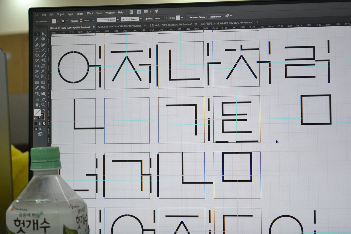
So I tried to make broken Korean font, which has 2 form factors of square one and broken square one.
They are classified by letter's structure, which is in square or breaking square.
As you know, Gestalt principle is very common in design, and there's many fonts following that principle.
So I tried to make broken Korean font, which has 2 form factors of square one and broken square one.
They are classified by letter's structure, which is in square or breaking square.
'긴 틈'과 '빈틈'은 제목용 서체로 디자인의 조형 원리 중 게슈탈트 원리에서 영감을 받아 제작하게 된 서체입니다.
자음과 모음이 끊어진 형태지만 읽히고 자모가 조합되면 재미있는 형태를 만들어냅니다.
'긴 틈'은 자음과 모음의 비율을 그대로 활용한 탈네모꼴 서체이며, '빈틈'은 한글의 기본적인 조합 형태인 네모꼴의 서체입니다.


Making Process
제작과정


Thank you for Watching!
감사합니다.


